
 By
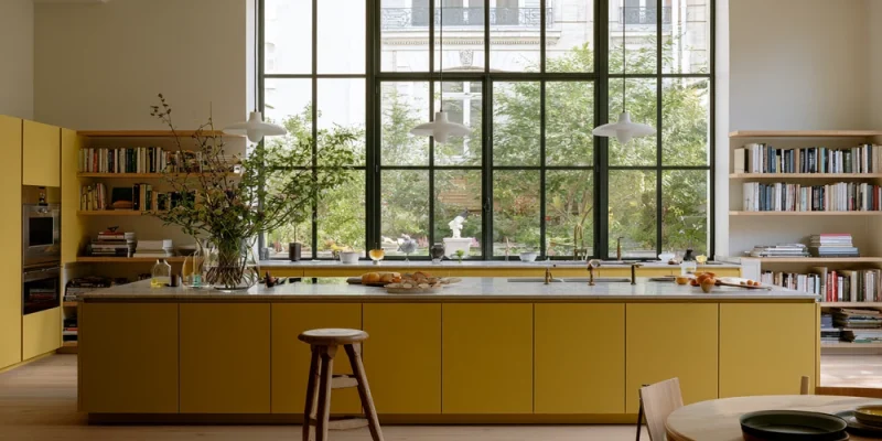
Picture this. You walk into a friend’s kitchen on a gray February morning, and the whole room seems to be smiling at you. The coffee tastes better. The light looks warmer. Then you notice why: the cabinets are yellow. Not neon, not school-bus, just a soft, buttery shade that makes everything around it look good.
That’s the magic of yellow kitchen cabinets done right. Done wrong, they can feel like living inside a highlighter. The good news is that the line between “cheerful” and “too much” is easy to find once you know where to look.
Why Yellow Works So Well in a Kitchen
Yellow is the color of morning. It reads as warm, friendly, and a little optimistic, which is exactly the mood most of us want in the room where we make breakfast and argue about whose turn it is to unload the dishwasher.
It also plays nicely with common kitchen materials. Wood floors, butcher block, brass faucets, white tile, and black stone all look at home next to it. William Durrant, director of the English cabinet maker Herringbone House, told Livingetc that yellow works with a wide range of metal finishes, especially brass. That flexibility is a big reason designers keep coming back to it.
Here’s the catch. Yellow is a strong communicator. It shifts a lot with light, and it gets louder the more of it you use. So the goal isn’t to avoid it. The goal is to give it a clear job and let the rest of the room support it.
Pick the Right Shade Before Anything Else
Most regrets about yellow kitchen cabinets start at the paint store. Someone falls for a tiny chip, paints thirty doors, and discovers their kitchen now glows. Small chips lie. Large areas of color always look brighter and more intense than the swatch.
Think in Families, Not Single Colors
It helps to sort yellows into a few loose groups:
- Butter and cream yellows. Soft and calm. Farrow & Ball’s Dorset Cream and Benjamin Moore’s Chestertown Buff sit in this zone. From across the room, they can almost read as warm white, which makes them the easiest place to start.
- Classic mid-yellows. Benjamin Moore Hawthorne Yellow (HC-4) is a longtime favorite. Benjamin Moore lists its light reflectance value at 71.33, so it bounces back plenty of light without feeling stark. Farrow & Ball Sudbury Yellow (No. 51) also lives here, a soft mid-yellow that reads brighter in sunny rooms and gentler in dim ones.
- Ochre, mustard, and golden tones. Deeper and earthier. Think Benjamin Moore Golden Tan or Sherwin-Williams Butterscotch (SW 6377), which Sherwin-Williams describes as an orange with yellow undertones. These feel grown-up and cozy, especially with wood.
- Lemon and citrus yellows. Fresh and bold. Farrow & Ball Citron (No. 74) and Babouche (No. 223) belong here. Babouche is named after Moroccan leather slippers, and it gets more intense across a large area, so it’s best for people who really mean it.
Watch the Undertone
Every yellow leans a little green, a little orange, or a little brown. Green-leaning yellows can look sharp and fresh in a bright modern kitchen, but they can turn sour under warm bulbs. Brown and orange undertones feel cozier and tend to get along better with wood floors and warm counters. Benjamin Moore even notes that Hawthorne Yellow’s orange undertone picks up on the colors around it, which is a polite way of saying your neighbors matter.
Test Like You Mean It
Durrant’s advice to Livingetc is simple and smart: use big samples, paint a large patch, and let it dry fully before you decide. Yellow can look almost gold depending on your light and how many coats you use. So put a sample board next to your counters, check it at 8 a.m., at noon, and after dinner with the lights on. If it still makes you happy at 9 p.m. under your pendant lights, you’ve found your shade.
Decide How Much Yellow Your Kitchen Can Handle
This is where “star of the show” and “going overboard” really split apart. You don’t have to paint every cabinet to get the effect.
Designers often lean on the 60-30-10 rule: about 60 percent of a room in a main color, 30 percent in a secondary color, and 10 percent in an accent. In many kitchens, cabinets take up so much visual space that they become the main color by default. That’s a lot of yellow. If you want it to feel special rather than overwhelming, consider giving yellow a smaller, more focused role.
Three Ways to Dial It In
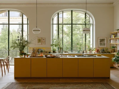
Just the island. A yellow island in a kitchen of white or wood perimeter cabinets is the classic “taste test.” It gives you a bright focal point right where people gather, and it’s easy to repaint later if you change your mind.
Lowers only, or uppers only. Yellow base cabinets with white or open wood shelves above keep the color grounded and keep the top of the room airy. Flip it, and yellow uppers with darker lowers can feel playful and unexpected.
A single zone. Paint one hardworking area, like a coffee bar, a pantry wall, or a built-in hutch. Durrant even suggests trying yellow in a pantry or utility room first, since it’s a lower-stakes place to experiment.
Want a full kitchen of yellow kitchen cabinets anyway? Go for it. Just choose a softer shade and keep the surfaces around it calm.
Choose a Finish That Flatters the Color
Sheen changes how yellow behaves. A flat finish looks soft and chalky but scuffs easily, which is not ideal near a toddler with a sippy cup. A higher sheen is tougher and easier to wipe, but it reflects more light, so the yellow looks brighter and shinier.
For most kitchens, a satin or eggshell finish hits the sweet spot. Farrow & Ball recommends its Modern Eggshell for kitchen cabinetry, describing it as the toughest finish in its range with a 40 percent sheen. Benjamin Moore offers cabinet-specific lines like Advance, which levels out into a smooth, furniture-like surface. Gloss can look fantastic on a lacquered, modern yellow kitchen, but it also shows every ding and brush mark, so save it for doors in great shape.
Door style matters too. A Shaker door adds shadow lines that soften a strong color. A flat slab door shows the color as one bold block, which looks sleek with a muted yellow and very loud with a bright one. Once you’ve thought through shade, amount, and finish, it gets a lot easier to picture your own kitchen, and browsing real yellow kitchen cabinets is the fastest way to see how a color looks on actual doors instead of a tiny chip.
Ground the Color With Calm Surroundings
Yellow shines brightest when it has a quiet supporting cast. Think of the rest of the room as the backup singers. They should sound great, but nobody should be fighting for the microphone.
Counters and Backsplash
White or soft gray quartz, honed marble, and simple white tile give yellow room to breathe. White subway tile is a classic for a reason. If you want more drama, black or charcoal stone looks striking against golden and mustard tones. Durrant points to a kitchen with black stone counters and backsplash paired with warm timber floors, a combination that feels rich instead of loud.
Skip busy granite or a patterned backsplash full of competing colors. When two bold things share a wall, they both lose.
Walls and Floors
Keep walls light and neutral, like warm white or a pale greige. Wood floors are a natural partner, especially oak with honey tones. If you want a bit of fun, a black-and-white checkerboard floor with butter-yellow cabinets has a charming retro diner feel without tipping into costume.
Let the Hardware Do Some of the Talking
Hardware is the jewelry of your cabinets, and it shapes the whole mood. Durrant put it nicely: a wood handle makes yellow feel more country, a sleek brass one feels more modern, and satin nickel feels timeless.
Here’s a quick cheat sheet:
- Unlacquered or aged brass warms up any yellow and ages into a soft patina. It’s the go-to pairing for good reason.
- Matte black adds crisp contrast, great with brighter lemon tones and modern slab doors.
- Polished nickel or chrome keeps pale yellows cool and fresh, a nice match for a cottage look.
- Wood or leather pulls lean rustic and relaxed, perfect with ochre or mustard.
One rule worth following: pick one or two metal finishes and repeat them. Your pulls, faucet, and light fixtures should feel like they came from the same family, even if they’re not identical twins.
Light Changes Everything
Yellow is more sensitive to light than almost any other color. A north-facing kitchen gets cooler, bluer light, which can make some yellows look a bit flat or greenish. A warm or mid-tone yellow with a touch of orange usually helps there. South-facing kitchens get warm, strong light all day, so even a soft butter shade can look bright, and a bold lemon may feel like a lot by mid-afternoon.
Your bulbs matter too. Very warm bulbs push yellow toward gold. Cooler bulbs can make it look sharper. A warm-white bulb, somewhere in the middle, tends to keep yellow looking natural. Before you commit, check your sample under the lights you’ll cook with at night.
FAQ About Yellow Cabinets
Are yellow kitchen cabinets a passing trend?
Yellow has shown up in kitchens for decades. Softer, earthier shades like butter, ochre, and cream tend to feel timeless rather than trendy, so they’re the safer long-term pick.
What color countertops go best with yellow cabinets?
White and soft gray are the easiest matches. Black or charcoal stone looks bold and polished with deeper golden shades. Warm butcher block works well with pale yellows for a relaxed, cottage feel.
Will yellow cabinets hurt resale value?
Bold colors can be a personal choice that not every buyer shares. A softer yellow, or yellow only on the island, is easier for most people to love and simple to update later if needed.
Can I mix yellow cabinets with wood?
Absolutely. Yellows with brown or orange undertones look especially good next to oak, walnut, and butcher block. Pale yellow lowers with natural wood uppers or open shelves is a pairing designers use often.
Bringing Your Sunny Kitchen to Life
A yellow kitchen doesn’t need to shout to get noticed. Pick a shade that suits your light, give it a clear role, choose a finish that can handle real life, and surround it with calm, simple materials. Do that, and your cabinets will feel like a warm hello every time you walk in, not a dare.
If a buttery island or a set of ochre lowers has been living rent-free in your head, now is a great time to start looking at real doors, real finishes, and real hardware. Seeing the options up close is usually the moment the right yellow finally clicks.






Comments