
 By
By 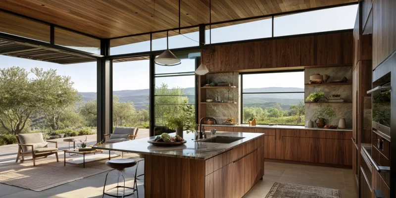
Some kitchen trends look great for a year or two. Then they quickly start to feel dated. Mid century design has managed to avoid that problem.
One reason is its strong connection to natural materials and warm colors. Walnut cabinets, warm wood grains, creamy walls, earthy tiles, and soft brass details can make a kitchen feel stylish without making it cold.
That is why walnut works so naturally in mid century modern kitchens. It brings warmth, texture, and character while still supporting the clean lines that define the style.
The result is a kitchen that feels modern but comfortable. It can look polished without becoming too formal.
So, what makes walnut and warm tones such a powerful combination? Let’s look at the design ideas behind the look.
Mid Century Modern Design Was Made for Natural Materials
Mid century modern design became popular during the middle of the 20th century. Homes from this period often focused on simple shapes, open spaces, practical layouts, and a strong connection with nature.
Wood played an important role.
Instead of covering every surface with decoration, designers allowed materials to become part of the visual interest. The grain of a wooden cabinet could provide enough character on its own.
This idea still works beautifully today.
Walnut has a rich natural grain and deep color. It does not need complicated doors, heavy trim, or decorative carvings to stand out.
A simple walnut cabinet can become a major design feature.
Why Walnut Feels So Right in the Kitchen
Walnut has something many other materials struggle to provide: natural richness without looking overly fancy.
Its color can range from medium brown to deep chocolate. Some boards have lighter streaks, while others show dramatic grain patterns.
That variation creates depth.
In a kitchen filled with straight cabinets, flat countertops, and smooth appliances, walnut prevents the room from looking too plain.
It adds visual movement without adding clutter.
This makes it especially useful for flat-panel cabinetry, which is common in mid century design.
Warm Tones Make Modern Spaces Feel More Comfortable
Modern kitchens can sometimes become too cold.
White cabinets, gray countertops, stainless steel appliances, and bright lighting may create a clean room. But too many cool surfaces can make the space feel less welcoming.
Warm tones change the mood.
Think about colors such as:
- Walnut brown
- Cream
- Terracotta
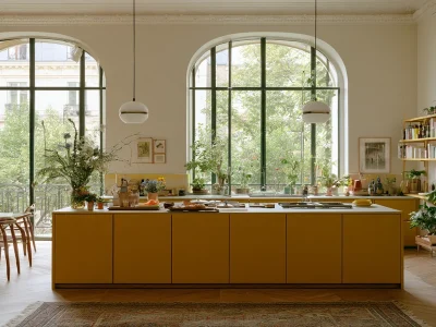
- Mustard yellow
- Burnt orange
- Olive green
- Warm beige
- Muted gold
These shades bring softness to sharp modern lines.
You do not need to use all of them. Even two or three warm elements can completely change the feeling of a kitchen.
A walnut island against warm white walls, for example, can provide plenty of character.
Walnut Creates Natural Contrast
Good kitchen design often depends on contrast.
If everything is the same color, the room can look flat. If there are too many competing colors, it can become busy.
Walnut sits nicely between those two extremes.
Picture dark walnut lower cabinets with a light cream countertop. The dark wood gives the kitchen weight, while the lighter surface keeps it bright.
You could also use walnut only on an island and choose warm white cabinets around the walls.
This gives the island a clear purpose without introducing an unrelated color.
The contrast feels intentional.
Flat-Panel Walnut Cabinets Capture the Look
Cabinet style matters almost as much as cabinet color.
Traditional raised-panel doors can make walnut feel more classic. For a stronger mid century look, flat-panel or slab cabinet doors usually work better.
Their smooth fronts allow the wood grain to become the main feature.
There is another benefit.
Simple doors make rich walnut feel lighter. You get the beauty of dark wood without filling the kitchen with decorative details.
Handle-free cabinets can create an even cleaner appearance. Slim pulls are another good option if you want visible hardware.
Warm White Is Better Than Stark White
White and walnut are natural partners, but the type of white matters.
Very bright white can create a sharp contrast against brown wood. Sometimes that works. However, a softer white often creates a more relaxed mid century feeling.
Look toward creamy whites, ivory, or warm off-white shades.
These colors still reflect light and keep the room open. At the same time, their warm undertones connect better with natural wood.
You can use them on walls, countertops, backsplashes, or upper cabinets.
The combination feels fresh without becoming sterile.
Earthy Greens Bring the Outdoors Inside
Want more color?
Green is one of the easiest colors to combine with walnut.
Olive, sage, moss, and muted forest green all work well because they already exist beside brown tones in nature.
Try sage green backsplash tiles behind walnut cabinets.
Another option is olive green lower cabinets paired with a walnut island.
Even a few plants can introduce enough green to change the room.
The goal is not to create a jungle. A little natural color can help reinforce the indoor-outdoor connection found in mid century design.
Mustard and Burnt Orange Add Retro Personality
Not every mid century kitchen needs bold retro colors.
Still, small touches of mustard yellow or burnt orange can add personality.
The key word is small.
You could introduce these shades through bar stools, artwork, pendant lights, dishes, or a rug.
Walnut provides a calm background that helps stronger colors feel controlled.
This gives you the retro influence without making the kitchen look like a movie set from the 1960s.
Brass Hardware Adds Another Layer of Warmth
Hardware may seem like a small detail, but it can influence the whole kitchen.
Brass works particularly well beside walnut.
Both materials contain warm visual tones, so they naturally complement each other.
Consider slim brass handles, simple knobs, a brass faucet, or warm metal pendant lights.
You do not need every metal surface to match.
In fact, mixing brass with black or stainless steel can keep the room from looking overly coordinated.
The important part is balance.
Lighting Changes How Walnut Looks
Walnut can look very different depending on the lighting.
Under cold blue-white lights, the wood may appear darker or flatter. Under warmer lighting, its brown tones and grain become much more noticeable.
Natural daylight is even better.
Large windows can bring out details in the wood throughout the day.
For artificial lighting, consider warm or neutral lighting rather than extremely cool bulbs.
Under-cabinet lights can also highlight walnut surfaces while making food preparation easier.
A well-lit walnut kitchen feels rich. A poorly lit one may simply feel dark.
Use Walnut Without Making the Room Too Heavy
One common concern with dark wood is that it can overwhelm a small kitchen.
That can happen, but it is easy to avoid.
You do not have to cover every cabinet in walnut.
Try walnut lower cabinets with light upper cabinets. Use it only on the island. Add a walnut pantry wall while keeping the rest of the kitchen cream.
Open shelving is another option.
These approaches give you the warmth of walnut while leaving plenty of lighter surfaces around the room.
Natural light also makes a big difference.
Countertops Should Support the Wood
A beautiful walnut kitchen can lose some of its charm if the countertop fights for attention.
Simple surfaces are often the safest choice.
Warm white quartz can brighten dark cabinets. Cream stone can create a softer appearance. Light terrazzo can add a playful mid century touch.
You can use stronger patterns, but be careful.
Walnut already has visible grain. A highly dramatic countertop placed directly beside it may create too much visual movement.
Allow one material to lead while the other supports it.
Backsplashes Can Add Texture Without Creating Clutter
The backsplash is a great place to introduce subtle mid century character.
Small geometric tiles can work well. So can vertical stacked tiles, handmade ceramic tiles, and simple square designs.
Warm white, olive, cream, mustard, and muted terracotta are all useful choices.
Again, restraint matters.
If your walnut cabinets have strong grain patterns, consider a simpler backsplash.
If the wood is more uniform, you have more freedom to experiment with shape or color.
Do Not Forget the Floor
Flooring can connect the whole color palette.
Light oak flooring creates contrast against dark walnut cabinets. Warm stone provides a natural, grounded appearance. Terrazzo can add a more playful retro feeling.
Try to avoid having several wood tones compete with one another.
They do not need to match exactly. In fact, perfect matching can feel unnatural.
Instead, look for woods that share similar warm undertones.
This creates connection without making everything look identical.
Keep the Shapes Simple
Walnut may provide the warmth, but clean shapes provide the mid century structure.
Look for straight cabinet lines, simple islands, thin furniture legs, rounded corners, and uncomplicated lighting.
Avoid adding decoration simply because a surface feels empty.
Empty space is part of the design.
A clean wall beside beautiful walnut cabinets can make the wood more noticeable than another shelf filled with accessories.
This is one reason the style continues to work in modern homes.
Mix Vintage Character With Modern Function
Your kitchen does not need to become historically accurate.
Today’s homeowners need features that older kitchens never had.
Modern appliances, hidden storage, charging points, induction cooktops, deep drawers, and smart lighting can all fit comfortably into the design.
The visual style can reference the past while the kitchen works for modern life.
That balance is important.
You want inspiration from mid century design, not a kitchen trapped in another decade.
Why This Combination Has Lasting Appeal
Walnut and warm colors work because they solve an important design problem.
They make clean modern spaces feel human.
Walnut provides natural variation. Cream and earthy colors soften hard surfaces. Brass adds subtle shine. Green and terracotta bring connections to nature.
At the same time, simple cabinets and uncluttered layouts prevent all that warmth from becoming heavy or old-fashioned.
That balance is difficult to achieve with trends built around one dramatic color or finish.
Final Thoughts
Great mid century modern kitchens are not created by copying every design idea from the 1950s or 1960s. They take the strongest parts of that era and adapt them for modern homes.
Walnut is perfect for this approach.
Its deep grain adds character to simple cabinets. Warm whites keep the space bright. Earthy greens, mustard, terracotta, and brass can provide small bursts of personality.
Most importantly, the materials feel natural together.
You end up with a kitchen that is clean but not cold, stylish but not flashy, and modern without losing its sense of warmth.




Comments